
Help Choosing Paint Colours You'll be Proud to Show Off
The CertaPro® My Paint Colours App allows you to virtually paint your home and choose the colours you like!
In , everyone chooses colours in their own way. Here we’ve assembled all the information you need to navigate your own path. Whether you already have firm colour ideas, need inspiration from examples and palettes, want to work with a professional colour consultant, or simply desire house painting colour tips, CertaPro Painters® colour resources make the colour selection process simple and stress free.
Interior & Exterior Paint Colour Tips
Intuitive concepts to keep in mind while you choose a palette for your painting project.
Start by checking out our Paint Colour Ideas – a collection of inspiring ideas to get your creative juices flowing.
Then take a look at our resources for Colour Consulting – professional guidance that really makes a difference.
Finally, follow our tips for both interior and exterior painting projects.
Exterior house painting by CertaPro Painters® Exterior Tips:
- Look for interesting architectural details, or add some, that can sparkle with a contrasting or accent colour.
- Drive through various neighborhoods, established and new, to see colour in action. Make note of appealing exterior paint colour schemes and adaptability to your own home.
- Define the entry. Use exterior paint colour as a “Welcome” sign to your home.
- Windows are the eyes of a home — they can add or even define the character of a home. Decorating them lends crispness to the colour scheme.
- Consider the exterior colours that cannot change like roofing shingles, brick, slate or stone. Choose colours that incorporate or complement these tones.
- Balance is important between light and deep colours, as well as warm and cool colours; consider not just the exterior paint colour scheme, but all the elements that make up the surroundings.
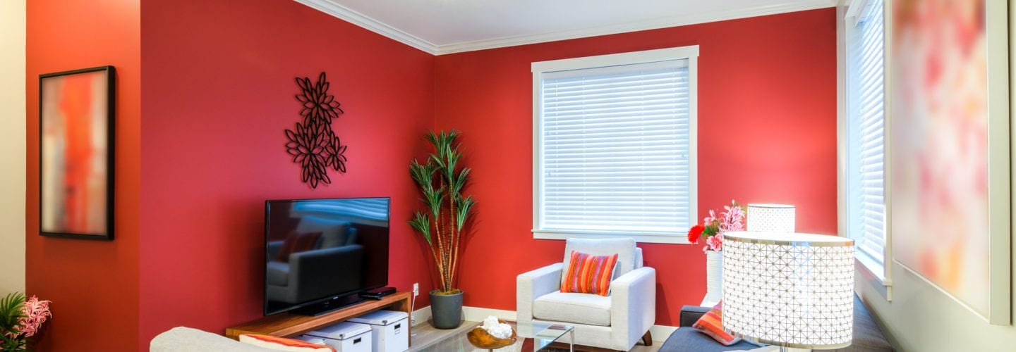
Interior house painting by CertaPro Painters® Interior Tips:
- Determine the mood you want to create with the room. Warmer tones are friendly and inviting. Cooler tones create calm and relaxing spaces.
- Keeping the trim all one colour provides continuity as you move from room to room. Stark white in a semi- or full-gloss creates a very formal look.
- If you want your furniture, carpets, and artwork to be the focal points of the room, stay away from bold paint colour choices which will compete with the furnishings for attention. Choose a wall colour from a piece or two that will tie the elements together.
- Darker colours make rooms seem smaller, so be especially careful selecting these if the room does not have a lot of natural light or the ceilings are low.
- Adding a slightly lighter tint of the colour you choose for the walls to the ceiling creates an intimate environment. This is often appropriate for dining rooms and master bedrooms.
- Think about ‘flow’ and how the colours of neighboring rooms will work together. Very dark to very light transitions, or transitions from rooms with highly contrasting colours can either be jarring or invigorating.
- Wet rooms (kitchens, baths, and laundry rooms), as well as hallways, benefit from having paints applied that can withstand scrubbing. While these can now be purchased in flat finishes, the satin and egg-shell finishes are better at resisting the absorption of moisture cooking and cleaning, as well as resisting oils and dirt from fingers.
